


OH,
HEY!
Hi, I'm Britt!
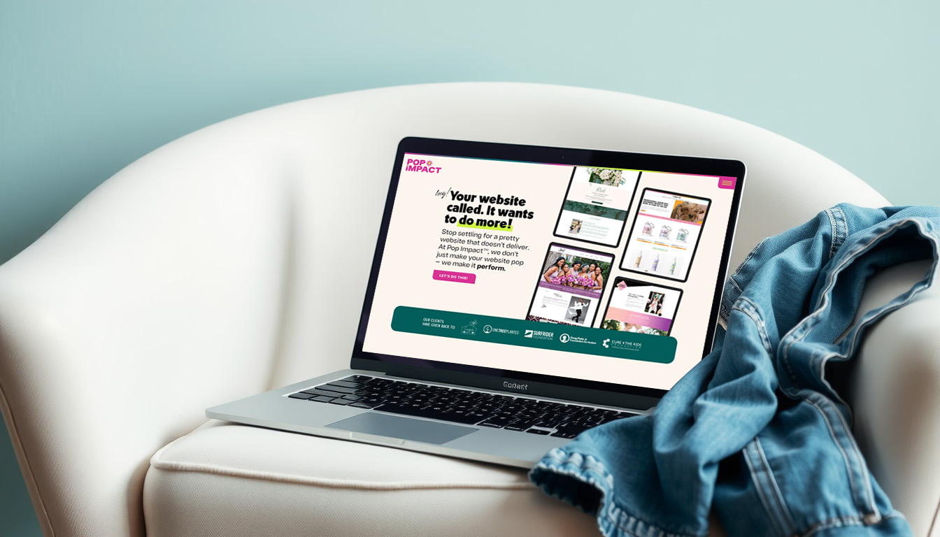
Web designer. SEO strategist. Pop culture enthusiast. Britt is the founder of Pop Impact™, where bold, purpose-driven websites aren’t just pretty, they perform. With 15+ years of experience, her team helps creative entrepreneurs build online spaces that get seen, get results, and give back.
Categories
Portfolio
SEO
Website Design
Showit

From Ghosted to Googled
You’re showing up…but your website? Not so much.
This free mini-guide walks you through the exact steps to get found, boost traffic, and turn clicks into clients—without the tech stress.
Designing with Purpose: How Brand Values Shape Website Layout
SHARE POST
A website shouldn’t just look good. It should feel like you and guide visitors in a way that reflects what you care about.
That’s why at Pop Impact™ don’t start with colors or fonts. We start with your values.
When your layout reflects what matters most to your brand, it becomes more than just than just a collection of pages. It becomes a tool for connection, trust, and action.
Here’s how that plays out in real websites.
1. If You Value Clarity, Keep It Clean
A brand rooted in transparency, education, or honesty needs space. Literally.
That might mean wide margins, focused headlines, or fewer competing elements on each page. Clean layouts feel approachable and trustworthy. They tell your audience, “We’re here to help you, not overwhelm you.”
Design Tip: Give each section breathing room. Avoid stacking too many messages or calls to action back-to-back.
2. If you value inclusivity, make it easy for everyone
Inclusive brands prioritize access. That shows up in choices like high contrast text, large font sizes, and intuitive navigation. Your layout should make it easy for anyone to find what they need, no matter their device, ability, or background.
This is a BIG one here at Pop Impact™. Not only with our website, but with any website we design.
Design Tip: Use clear headings, logical page flow, and easy-to-read type. Bonus points for accessibility tools like alt text and keyboard-friendly design.
3. If you value boldness, go all in!
Let’s say your brand is daring, high-energy, or unapologetically different. Your layout should reflect that.
We’re talking overlapping elements, unexpected animations, color blocks, or bold typography that pulls visitors in. Just make sure your design supports your message and doesn’t compete with it.
Even with bold design, though, make sure you leave some breathing room.
Design Tip: Use movement and contrast to guide the eye but always give visitors a clear next step.
4. If you value connection, bring in stories
Connection-driven brands need layouts that make space for storytelling. That could look like a scrolling testimonial section, a blog that showcases personal stories of clients (with their permission, of course!) or a visual timeline of your brand journey.
Design Tip: Let visitors see themselves in your story. Break longer content into visual blocks so it’s easy to digest.
5. If you value impact, make it visible
Your give-back model shouldn’t be hidden three clicks deep. If impact is a core part of your brand, build it right into the layout.
Showcase nonprofit partnerships on your homepage, use icon sections to call out contributions, or add a dedicated “Impact” section that updates with each milestone.
Design Tip: Use visuals, numbers, or little call outs to highlight how your business gives back. Build the trust with your audience and show off your values to attract the right client!
Strategy and design go hand-in-hand
When we design a website here at Pop Impact™, layout decisions are never random. They’re rooted in your brand’s purpose and built to move visitors through your site with intention.
The result? A brand that not only looks aligned but feels aligned. And a website that connects the dots between what you stand for and what your audience is looking for.
If you’re ready for a site that leads with your values and brings in results, we’ve got you.